BRAND GUIDELINES
A simple system for using the Mammoth brand across digital, social, and print.
1. brand overview
The Mammoth brand is built to feel bold, confident, & human. Our visual system is designed for claritY while maintaining consistency across all touch points.
How to Use These Guidelines
These guidelines exist to make the Mammoth brand easy to use and instantly recognizable. They outline the core rules for how our brand shows up across digital, social, and print, from logos and colour to type and layout.
Use them as a practical tool, not a rulebook. Start here, follow the system, and let the work do the talking.
why consistency matters
Consistency is what builds trust and recognition. When our brand elements are used correctly and repeatedly, they create impact, especially in fast-moving, mobile-first environments. Every touchpoint should feel intentional, confident, and unmistakably Mammoth.

2. Logos
Logo Types
Our logo comes in two core formats to ensure flexibility across different layouts and applications.
Horizontal Logo
The primary logo format for most uses. Best suited for digital, web, and wide layouts where there is ample horizontal space and maximum legibility is required.
Vertical Logo
A stacked version of the logo designed for taller or more compact spaces. Ideal for social media, signage, and layouts where a horizontal format is not practical.


Logo variations
Our logo is available in several variations to support different contexts while maintaining a consistent brand presence.
Primary Logo
The core brand mark and default choice. Use this version whenever possible to ensure strong recognition and consistency.
Descriptor Logo
Includes a supporting descriptor to provide additional context. Use when clarification is needed, such as for partnerships, sub-brands, or external-facing materials.
Slogan Logo
Features the Mammoth slogan to reinforce brand messaging. Best used in campaign work, marketing moments, and brand-forward applications.
primary logo

descriptor logo

slogan logo
Icon
The Mammoth icon is a simplified version of the logo designed for small-scale and space-limited use.
The standalone “M” from the Mammoth logo. Use for social avatars, favicons, app icons, and UI elements where the full logo is not required or would lose clarity.

white icon

grey icon

black icon
Clear Space
Clear space ensures the Mammoth logo remains legible, balanced, and visually impactful in every application.
The minimum clear space around the logo is equal to the cap height of the “M” in the Mammoth wordmark. This space must remain free of text, graphics, edges, or any other visual elements.
Maintaining clear space helps protect the integrity of the logo and ensures it stands out clearly across digital, print, and social applications.

File Format Guidelines
Keeps fonts, images, and layout consistent across devices. Easy to open and suitable for both email and high-quality print. Ideal for sharing final versions.
.png
Ideal for digital use when transparency is needed such as white logo over a coloured background. Maintains quality but has a larger file size than JPEG.
.jpg
Best for web and digital use. Compressed for smaller file sizes but does not support transparency. Often requested by web vendors.
.eps
A high-quality vector file perfect for print and large-scale applications. Scalable without losing quality. Often requested by signage or promotional vendors.
.svg
A web-friendly vector file that scales infinitely without losing quality. Great for digital designs such as websites and presentations.
File size terms
best for web & quick sharing (kb)
Small files for web images (under 500 KB) or quick online sharing. Not suitable for print.
best for email & print (mb)
Great for email attachments (under 5 MB) and print images. Small format (min 1 MB) or large format (5–10 MB).
best for video & large projects (gb)
Very large files like videos, high-res images, or full design projects.
EDITABLE / WORKING FILE FORMATS
.ai
Vector-based design file — can be scaled infinitely without losing quality. Needs Illustrator or similar software to open.
.indd
Layout file for multi-page designs like brochures or magazines. Requires linked images and fonts when sending to others.
.psd
Pixel-based layered design file. Perfect for detailed image editing, but often large in file size.
3. Colour
Brand Colours
Our colour system is designed to support clarity, accessibility, and strong brand recognition. A focused primary palette creates consistency, while secondary colours provide flexible support when used intentionally.
Primary Colours
Black, white, and Mammoth Yellow form the foundation of the Mammoth brand. These colours should be used most frequently and anchor all brand communications. Mammoth Yellow is the key brand accent and should be used purposefully to create emphasis, recognition, and impact.
Secondary Colours
Shades of grey support the primary palette and add flexibility across layouts and applications. Use secondary colours sparingly to create depth, hierarchy, and balance without overpowering the core brand colours.
C7 M0 Y71 K0
R245 G244 B104
HEX #f5f468
C73 M67 Y66 K83
R17 G17 B17
HEX #111111
C1 M1 Y1 K0
R250 G250 B250
HEX #fafafa
primary colours
C3 M0 Y43 K0
R252 G251 B164
HEX #fcfba4
C72 M64 Y62 K65
R41 G42 B44
HEX #292a2c
C16 M9 Y12 K0
R212 G217 B215
HEX #d4d9d7
C7 M4 Y6 K0
R234 G236 B234
HEX #eaecea
secondary colours
COLOUR USAGE GUIDELINES
CMYK
For printing. Ensures colours match on paper.
RGB
For screens (like monitors, phones, and tablets). Bright, vibrant colours for any digital display.
HEX
For web. Exact colour codes used in websites and online platforms.
Pantone
For precise colour matching. Used in brand printing.
4. Typography
Brand Fonts
Our type system balances bold expression with clarity and accessibility.
Oswald: Leads as the primary headline typeface, strong, condensed, and confident, anchoring our visual identity across digital and print.
Work Sans: Serves as the foundation for body copy, offering readability and warmth through open, balanced letterforms that perform beautifully across mediums.
League Spartan: Bridges the hierarchy, providing structure and rhythm as a versatile subhead or accent typeface. Together, these fonts create a cohesive system that feels modern, approachable, and distinctly Mammoth.
All fonts are available for download on Google fonts and Oswald and Work Sans are available for download on Adobe fonts.
Aa
Oswald
Aa
League Spartan
Aa
Work Sans
example hierarchy
This type hierarchy example shows how Oswald, League Spartan, and Work Sans work together to create clear structure and visual balance. Each typeface plays a distinct role, supporting readability and flow across headlines, subheads, and body text.
40 Px
Headline: Oswald Bold
28 Px
Subhead: League Spartan Semi-Bold
15 Px
Body: Work Sans Regular
13 Px
Caption: League Spartan Regular
5. social media guidelines
our tone is authentic, genuine, community-driven, honest, and approachable. Use visuals that show real people and real moments with natural, relatable edits. avoid staged, overly polished, or generic stock content.
Social Media Guidelines
These social media guidelines are designed to help the Mammoth brand show up clearly and consistently across all social platforms. They focus on legibility, layout, and visual impact in fast-moving, mobile-first environments.
Use these guidelines as a practical reference when creating social content. They provide a clear framework to ensure posts, stories, reels, and videos remain on brand and easy to read at a glance.
COLOUR USAGE FOR SOCIAL MEDIA
Primary Colours
Core brand tones used for backgrounds, headline moments, and high-impact visuals.
Secondary Colours
Supportive accents used for highlights, graphic elements, call-outs, and layered compositions.
Accessibility & Contrast
Colours are selected to ensure legibility on mobile and across fast-moving social formats.
TYPE FOR SOCIAL MEDIA
Oswald: Primary Social Headline FontFor big, bold, attention-grabbing text in posts, reels, and stories. Ideal for titles, hooks, and main statements that need to stand out instantly. Great for thumbnails, hero text, and any high-impact messaging.
League Spartan: Supporting Social Display FontBest for sub-headlines that support the main message. Works well for call-outs, key points, and short labels on graphics and videos. Clean and strong for secondary text on carousels, reels, and overlays.
Work Sans: Social Body & Utility FontFor longer text, descriptions, and readable blocks in carousels or info posts. Ideal for small text on graphics, including details, disclaimers, and brief annotations. Balanced and simple for UI-style elements, tags, and subtle supporting text.
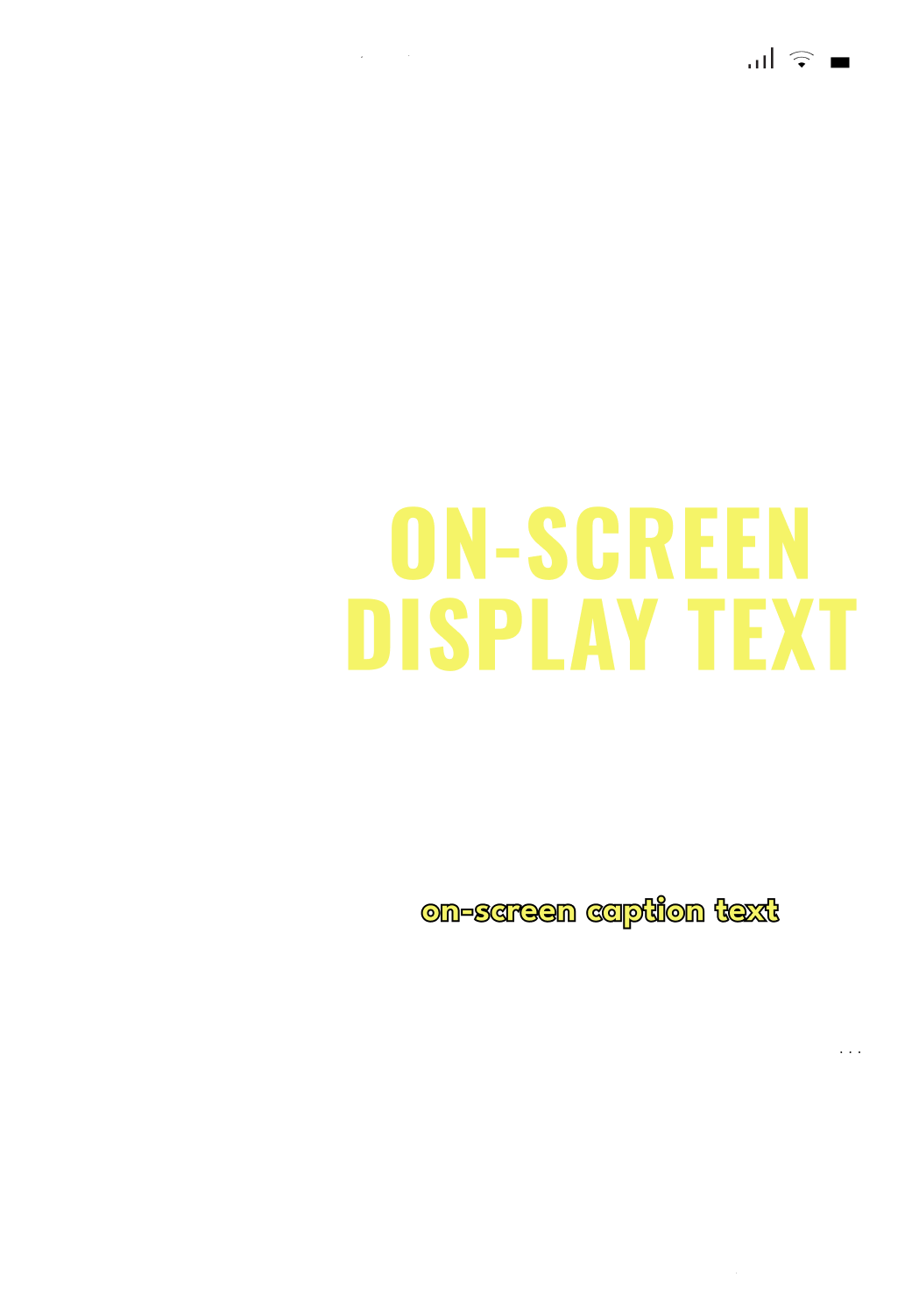
FONT USAGE REELS AND VIDEOS
Oswald Bold
Colour: Yellow #F5F468
Letter Case: Uppercase
Tracking: -50
Size: Large (100-300px)
Effects: Drop Shadow (if needed)
Colour: #000000, 50% (soft)
X: 7 px Y: 7 px
Blur: 33 px Blend: Multiply
League Spartan
Colour: Yellow #F5F468
Letter Case: Sentence Case
Tracking: 0
Size: small (48 px)
Effects: Stroke
Colour: #000000 Weight: 1 px
Align Stroke: Center (default),
or Outside if required
Safety Zones
Social platforms apply interface elements and cropping that can affect how content appears in feed. Safety zones help ensure key text, logos, and visuals remain visible across all formats and devices.
Always keep important elements within the recommended safe areas. For detailed dimensions, layout examples, and format-specific guidance, refer to the Social Media Guidelines (PDF).
Story 1080 x 1920 px (9:16)

Reel 1080 x 1920 px (9:16)

Video Post 1080 x 1350 px (4:5)

Static Post 1080 x 1350 px (4:5)

6. Resources


